 |
| Wine Helps! |
Monday, March 31, 2014
Change
Sunday, March 23, 2014
Last Minute
There is always something to do in the last minute.
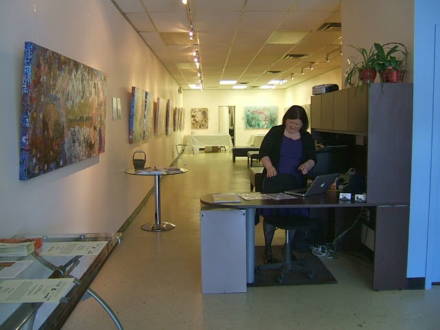
In fact some people rely on the last minute to get anything done! My solo show
was quite different in that respect for me. I had things under control about
two weeks before the delivery date. At least I thought so. I am not so good
with the business side of things; although I did do a lot better on the
advertising there still is room for a copious amount of improvement. For
example I received an email from a wonderful reporter for a local newspaper
wondering when I might be ready to let him know about the upcoming show…. That
was on Monday. Sigh. I did not contact the other media even then… Sigh again.
It is a Freudian slip showing I prefer being a hermit. Of course that does not
sell paintings. All in all the reception was remarkable in that so many people
did attend and so many of them wanted to stay longer than usual. Some promised
to return with someone else so they could contemplate the paintings more
intensely. My work does inspire contemplation. I suspect that is because it is
a product of contemplation. I love what I do. Life is good.
Monday, March 17, 2014
Books, Bubbles and Betterment

This is the week! I deliver my paintings to the
gallery on Wednesday and my opening is on Saturday between one and four in the
afternoon. So exciting! To commemorate this momentous event I have created a
book of all the images that will appear in the show. There are some people who
wish to buy all of them and this is one way they can. The books will be
available for sale at the opening and I will have some order forms there for
those who wish to purchase as well. Bubbles, well, I wanted two other words
that started with B. And if I stretch things I could say there are a lot of
circles in my work, circles looking like bubbles in fact. They create an awesome
amount of energy and help with the movement of the eye around the paintings.
Betterment, there is nothing better than creative work to loose preconceived
notions and get one on a path to openness and surrender. I so love what I do!
Life is good.
P.S.
You can order your copy on my website: www.karenblanchet.com
P.P.S. If you have not received an invitation to my opening, here it is:

Monday, March 10, 2014
Tin Foil

Quite often I use metallic colours, pens and actual metal in my images. Iridescence plays a big part in making the surfaces glow. It helps with the illusion of light. When it comes to filling in negative space or the occasional circle I use gold (real gold!), metallic foil or tin foil. How I happened on tin foil was serendipitous. Among the many preliminary layers on any canvas there lies gold or silver mixed with iridescence. I find silver works very well with the red/green complimentary combination. It is also brilliant with the phthaloblue/burnt orange duo. As I began to develop the painting at hand I heard the request for metal negative spaces…. Silver is so fugitive. It tarnishes. I have lots in my cupboard to prove it… I considered gold. Unfortunately there was no foundation in gold. None. It would look totally out of place. I considered metallic foil. It also is somewhat fugitive in that it does not retain its appearance in the long term. What was I to do? I cannot remember what I was cooking that night. What I do remember is whatever it was required tin foil. Yes! That is it! Tin foil is not as easily bent and torn as tissue paper. In fact it is quite uncooperative. Lately I have discovered the most efficient way to cut out the little pieces is to use tracing paper to trace the spaces then repress it over the foil to leave a cutting line. I have designated a set of scissors for the job. Actually it tears well along the straight indents. It is work intensive and in the end I have exactly what I want. So good! Life is so good.
Monday, March 3, 2014
Negative Space

I must admit I am hooked on negative space. That does
not mean I am a negative person… I just prefer developing the shapes around
what people usually look at; the shapes most people do not even know exist. I
must also admit I have taken it to the extreme. My new series does not have the
traditional “objects” one sees on any given day. Apart from the drawings of
women (or men as some see them), there is not a whole lot of representational
imagery. I choose the spaces to darken and lighten. Out of those choices
organic forms appear. This is not as easy as it sounds. As I gaze upon the
runs, drips and drops I see clear shapes between and these shapes are broken up
even further by the texturing I have previously added to the surface. The
texturing plays an important role in breaking up overly large areas such as the
‘sky’ or ‘water’. Instead of painting in the whole section with one monotonous
colour (usually the undercoat) I fill in the textured areas only leaving the
interplay of undercolours showing through… Negative spaces within negative
spaces! Fun! There are some decisions to make however. If I included every
negative shape instead of amalgamating some into a cohesive whole, chaos would
reign to the point of overwhelm. If I do not include enough it would cause a
case of underwhelm…. Balance, it is all about balance! Love it.
Subscribe to:
Posts (Atom)